About Access outlines the need for greater guidance when it comes to glass and highlights opportunities to ensure good design also incorporates safety
It is said that people in glass houses shouldn’t throw stones, and maybe the same goes for people in glass offices and shops, and behind glass generally.
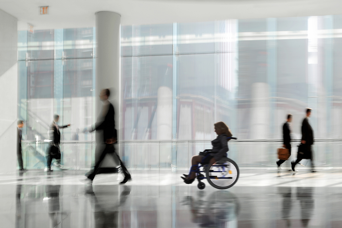
But while we would never advocate any aggressive contact with glass we recognise more than most that accidental contact is often inevitable. You can’t avoid what you can’t see, and in our experience, the increasing use of glass in building design presents an invisible hazard.
Poor manifestation, or no manifestation at all, is manifestly dangerous. As for some of the excuses used by offenders; well we can see right through them!
As in many other examples of legislation, the regulations around manifestation on glass are designed to promote safety and reduce the likelihood of accident and injury – and they also provide an opportunity.
Designing to ensure safety
Careful designers will make sure they adhere to the guidance because they don’t want to see people getting hurt by bouncing off glass doors and walls. Creative designers will look at the guidance and see space for a cool logo, a promotional message or some helpful information.
Under the provisions of BS8300, suitable manifestation comprises permanent markings or features within areas of full-height, transparent glazing, glazed walls or screens, fully glazed doors or glass doors. The aim is to prevent collisions by making the glazing more visible to building users.
Part K K5.2 of the Building Regulations requires that transparent glazing, with which people are likely to come into contact while moving in or about the building, shall incorporate features which make it apparent.
To ensure the manifestation is at a height which is convenient for people who are walking upright, who are seated, or who are short in stature, it should be located within two zones, from 850mm to 1000mm above the floor and from 1400mm to 1600mm.
Suitable manifestations are continuous or broken lines, signs, logos or patterns on the glass that cover at least 10 percent of the glazing within those zones.
So it’s not an enormous space, and it shouldn’t be a big deal to get it right. Warning signs held on with sticky tape or Blu-Tack are not acceptable, but a decent vinyl will do the job and also opens up a world of opportunity.
One office we saw had a glass wall decorated with graphics of trees. This had a two-fold effect. The trees identified the glazing and the addition of leaves indicated a secure area for holding confidential conversations and meetings.
Another at a rail ticket office filled the gap between the top and bottom zones with a list of destinations. You could include such features as directions to other areas of the building, logos for the business or for particular services and facilities, information about what you do, and it won’t have an adverse impact on lighting levels.
The problem can extend to other features – low glass tables can be a trip hazard if it is not easy to see the edge, and security barriers into buildings are often made of clear glass. The supports are clearly visible, but the actual barriers might not be.
The solution is to think ahead and design the features in a way which helps people to see them. There is no requirement for two colours, but it is better if people use them. They should contrast tonally with each other so that if you lose one colour in the background, the other will still be visible. If you have black and white squares against a light background the white might be lost but the black will stand out.
You have to look at it from both sides of the glass panel. Taking an entrance as an example, when you look into the building the background will generally be constant apart from the movement of people. But looking out the background may constantly be changing as a result of traffic, pedestrians walking past, and seasonal vegetation changing colour. In the summer the vegetation might provide some contrast, but that can be lost in the winter.
It’s a modern problem. Glass is now much more commonly used in all sorts of environments – offices, colleges, shopping centres – as an invisible architectural feature. It is tougher than it used to be, more stylish, decorative and attractive and it can present a real hazard.
People get it wrong because they are not aware. They have never given it a thought, and that is typical of a lot of accessibility issues. Once designers are made aware of how the built environment is disabling, they are more likely to change their future designs to take this new knowledge on board.
When it comes to manifestation, there are not many examples of good practice because there is not a lot of good practice generally. Just because glass is toughened and harder to break doesn’t mean it’s not a problem. People just break themselves instead of the glass.
Ian Streets
About Access Limited
info@aboutaccess.co.uk


")