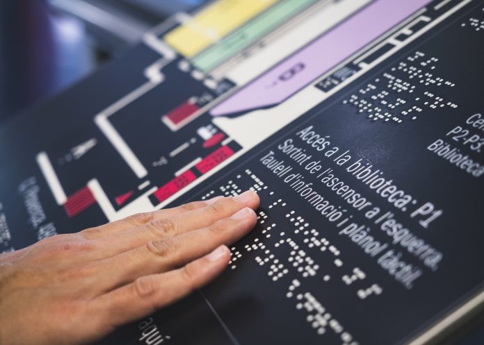
Ian Streets from About Access discusses signage and the importance of accessibility implications when choosing the design of signs
We know from the abundance of street furniture that the desire to tell people who you are, what you do and where to find you is becoming an obsession.
It brings with it the issue of the physical obstacles presented to people who have mobility difficulties. That’s something we’ll no doubt come back to, but for now, we want to focus on the shortcomings of some of that signage, and on the fact that some people can’t focus on the signs at all because of poor design.
We’ve been studying examples at historic sites, and what we’ve found has encouraged us to look at other visitor attractions and at the wider built environment. The uncomfortable conclusion we’ve reached is that a lot of people who create the signs don’t often think of the needs of disabled people, and some of their efforts also make life difficult for non-disabled people.
There is good guidance to be found, notably in the Sign Design Guide, which is produced jointly by the Sign Design Society in conjunction with the RNIB and is currently being reviewed.
Their aim is to make environments accessible to everyone and to promote the concept of “inclusive signage”, inside and outside, by providing clear guidance on producing signs and other wayfinding information.
They describe the guide as “essential reading” for architects, designers, wayfinding managers, access officers and sign manufacturers. The publication addresses many information formats – visual, embossed, braille, audible and other wayfinding devices for people with reduced ability – and is available from www.signdesignsociety.co.uk.
A lot of people don’t really understand that the signs they are designing will at some point be relied upon by someone who has a visual impairment, or maybe cognitive issues.
Even if your eyesight is perfect it’s entirely likely that you will struggle to read a sign which is made of reflective materials when it’s catching the sun. You might need to move to a different angle to see the sign properly, but that might not be an option for someone who has a disability.
The location, height and angle of signs should all be considered, and the detail of the content is no less important.
How many words are there in a sentence? How many characters in a line? It is important to make the written language accessible, as demonstrated by the fact that many signs are presented in different languages.
Some of the key points to remember are to keep the design and the terminology simple. Don’t try to be too clever. Don’t overthink it. Write it with first-time visitors in mind. Not everyone will know their way around the premises so don’t make assumptions, inside or outside the building.
Typographic accessibility is important, as is the difference between legibility and readability. Legibility matters in terms of car number plates. Readability is important in terms of text, such as information signs in a museum.
Font style, sizes and spaces are important so let’s play with some. With Times New Roman, i, I and l are different, although there is potential for confusion between the digit 1 and a lower case l. In Arial, there’s no difference between the capital I and the lower case l.
If you can use familiar typefaces in your design do it, and remember that text fonts are designed for readability and versatility. Display fonts are more decorative and designed for expression and style. Upright characters are better than slanted, and characters that are too wide or too narrow will have decreased legibility. The height between lower case and upper case letters is also important, as are the apertures in some letters. In some styles, c or e can be taken for o.
And while the digital sector is a whole new story, remember also that whereas most websites allow users to increase the text size, printed publications obviously do not. When designing posters, timetables, menus and other printed information consider spaces between letters and within letters, as well as the use of bold and block capitals, which can cause problems.
In terms of layout, justified text, set left, makes it much easier for readers to find the start of the line.
By thinking about how the text will appear you will improve the chances of getting your message across. But think also about how it will sound using text to speech technology, or even with someone reading your text to someone who is unable to read it. Does it make sense as sound?
The key is to anticipate the wide range of disabilities an audience might face, such as cognitive, motor and sensory impairments. Understand how accessible design benefits an ageing population, a factor that means almost all of us will experience disability at some point in our lives.


