Ian Streets, managing director of About Access, looks at some modern building features which are presenting – rather than preventing – obstacles to access
We’re seeing ever-more examples of aspects of modern building techniques having the impact of bamboozling some users as designers put the emphasis on style over substance.
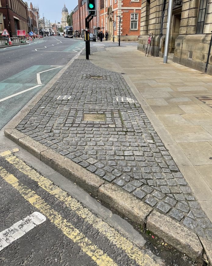
Deterrent paving doesn’t just present a hazard or inconvenience to disabled people; it can create problems for almost anybody if it catches them by surprise.
It’s almost getting to the point where signage might be required to warn people of the presence of deterrent paving – but that’s another area where thoughtless design can exacerbate rather than alleviate a problem.
Deterrent paving has become a double-edged sword
We’re thinking purely about instances of deterrent paving, which is designed and located ostensibly to keep pedestrians away from such hazards as loading bays and busy roads.
It’s a close relation to some forms of hostile architecture, where features including spikes and bumps are added to encourage rough sleepers to move along. But whatever the purpose, the implications for visually impaired people are the same. Instead of preventing people from encountering a hazard, they are presenting another one.
The idea of deterrent paving is to make it difficult for pedestrians to walk in areas considered dangerous. You might find it in the middle of dual carriageways, at the side of pedestrian crossings or next to a loading bay. It might also be used to block off a road to vehicles or to prevent drivers from parking on a footpath.
The approach is to create a surface which is so uneven as to make it really difficult for people to walk on it, in theory removing the temptation to use it as a shortcut. The designers do that by inserting blocks into the surface so that they protrude upwards, with insufficient space to step between them safely.
They are very different from tactile paving, where the raised features are much more subtle. The spots or ribs on the surface of tactile paving are easy to sense underfoot and will let users know that they are approaching a crossing. But they’re not so prominent that they create a trip hazard.
Deterrent paving can vary from a style which is similar to – but more severe than – cobbles to the more substantial and prominent ridges and points. It is specifically designed to obstruct and the rule seems to be the more uneven and unyielding the surface, the better.
The idea is that it provides a visual and physical deterrent – people see it, so they avoid it. The problems arise when people don’t see it and lose their footing as a result.
From the examples of deterrent paving that we’ve spotted, it’s obvious that anyone who is visually impaired could experience problems. There appears to be little or no attempt to distinguish between the shades of grey stone or brick used in the construction and even with small protrusions, there are shadows, which don’t help. A fall leads to a landing on a hard, uneven, possibly pointed surface and there are reports of people sustaining serious injuries.
Guidance says that deterrent paving should not be used in the immediate vicinity of access routes. Where this is unavoidable, measures should be taken to minimise the risk of harm to users and it should contrast visually with the surrounding surfaces.
But one example we saw raises the question of whether deterrent paving is needed at all. A rough, cobble-style paving next to a pedestrian crossing was separated from the road by railings. Can’t we just have the railings, please?
Signage must also strike a balance between design and accessibility
One of the general principles of signage is that it shouldn’t be too small. But nor should it be too big. Does it really need to be the height of a tall human being? Maybe on occasions, but only if it’s high up or a long way off – perspective is everything.
If you’re too close to something, you’re unlikely to see it for what it is and while that might be fun in an art gallery, it’s just frustrating if you’re relying on an oversized sign to help you find your way around.
The main offenders here are the often huge digits you might find on a landing in an office block or multi-storey car park. The whim of the designer can leave people wondering at waves of curves and arches or bemused by the bits missing from a jagged stencil design.
There’s nothing wrong with a passion for creativity but, with signage, first and foremost there has to be a commitment to effective – and quick – communication, otherwise what’s it for?
The standard rules of signage include location, height and angle. Fonts should be clear, not cluttered, colours should offer contrast and materials should be selected carefully to avoid problems with reflection and glare.
The signs the designers are creating will at some point be relied upon by a person who has a visual impairment or maybe cognitive issues. But again, we’re not just thinking here about ensuring signs can be understood by disabled people. Not everyone will know their way around the premises so don’t make assumptions, inside or outside the building.
Create and display signage with first-time callers in mind and consider the scenario around an emergency evacuation. It’s inconvenient if a delivery driver or a business guest is delayed trying to find their way around, but it’s rather more serious if the new visitor is a firefighter.
Ian Streets advises public and private sector bodies and businesses on accessibility legislation, issues and best practice.
Ian Streets
CEO
About Access
Tel: +44 1482 651101
Please note that this is a commercial profile.


